Product · · 4 min read
One screen is a mock. Four screens is a product.
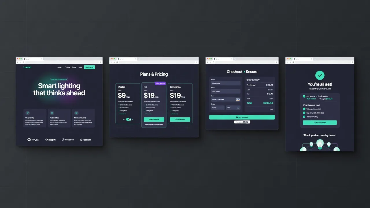
A single generated screen is a lovely artefact and a poor decision-making tool. You cannot tell from a landing page whether the empty state works, whether the settings screen needs a sidebar, or whether the navigation survives a second level.
Flows expose the holes
The moment you generate the screens around the first one, the questions get concrete. Where does this button go? What does the user see after they pay? What is this a dashboard of? The answers are cheap to get wrong on a canvas and expensive to get wrong in code.
Let the flow come from the design
The obvious implementation is a fixed list of page types (dashboard, settings, profile) applied to whatever you generated. It is also the wrong one: the screens have nothing to do with the product you just designed.
Reading the first screen and planning the journey from it costs one extra call and produces a flow that belongs to the thing. A pricing page implies checkout and a confirmation. An inbox implies a message view.
Consistency is the constraint
Every screen after the first has an obligation the first one did not: it has to look like it belongs. Passing the existing markup along as the reference does more for that than any amount of instruction about spacing scales.
Keep reading
- How a labelled sketch becomes a UI
You do not prompt a layout into existence. You draw the boxes, write what they are, and the screen is generated from that.
- How to label a UI sketch so the model stops guessing
Write the component type, a piece of real copy, or a size constraint. Those three labels do more than a longer prompt.
- A mood board is how the fifth screen matches the first
A palette of eight nice colours is a mood. A palette where each colour is bound to a role is a system.